
Design “Digital Advisor” Onboarding experience
Scope: Our design team was brought in to design the “customer onboarding experience” for a firm’s high net-worth clients - The journey would be for a prospective customer, to explore goal planning, build trust with an advisor, and open an account.
My role: I lead the design process and delivery: managing a visual designer and a junior UX designer through personas, design principles, and brand direction, culminating in our high-fidelity clickable prototype.

Challenges
Solving for interactive goal-setting, and customer-friendly account opening experience, while constrained by platform workflow requirements
Limited timeframe and no resources dedicated to user research/testing, to design for a poorly defined demographic, and validate the experience
The client needed us to guide their mobile and desktop strategy for not just the onboarding, but a future-vision overall customer portal
Demographics & Personas
Demographics for Client Experience
With an initially unbounded target audience, I coached our client through prioritizing the demographic and experiential segments for this product. For example, identifying that the target users were at least middle-aged, and already had material exposure to financial advising, drove the accessibility and interaction guidelines we created.


Target Personas
As is often the case, our client had only marketing-driven ”personas” available: My junior UX designer and I evolved these into provisional personas to cover behaviors, attitudes, and relevant dimensions to function as “provisional personas”; also educating the client on the need to more deeply research those aspects of their target audience
Design Concepts and Decisions

Data Visualization
Presenting abstract concepts such as ”risk level”, “future income” and likely time until the uncomfortable topic of “death” are not easily understood in retirement planning today.
I iterated our designs with retirement experts to explore diverse concepts for each of the time data visualizations, and guerrilla-testing the paper sketches with target demographic. In the process we developed recognizable distinct style elements for risk cones, good and bad outcomes.
Conversational design: People and Forms
Bringing Advisor to the forefront of interactions

I introduced elements of chatbot design, grounding on the image of the advisor to create the sense of a personal presence.
Throughout: The Advisor is “always there” in context to reassure the prospect that someone is available to speak to for help.
Conversational Forms: Introducing a friendly tone of voice
We used available employees to determine “you” versus “I” language and land on a tone that was unambiguous to users answering questions on their phone screens
I had us explore both conversational and form-based information gathering. Light testing showed that conversational interface was inviting during initial information gathering, and become confusing once the customer was presented with recommendations and visualizations, so we used that transition to shift users to a more presentation-oriented screen flow - focus on text cues, inferred and imported data, and interactive visualizations to give the user context.

Responsive Design

In order to capture the “conversational” nature for the initial introduction, I directed the desktop design to a readily scalable “chatbot” feel, with minimal adaptive and responsive design elements needed.

Mobile Dashboard to Desktop
I guided our visual designer in adapting mobile design elements to flow in a portal-style 12-column grid. The short time required us to asses on best industry experience how to adapt each module for the desktop considering information readability and priority.
Key areas of scalability are seen in the callouts for the Primary and Secondary navigation, as well as examples of the functional modules in mobile and desktop.

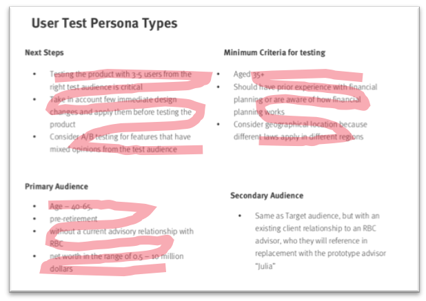
User Testing
While our project scope did not include user testing, my team knew that that some testing would bolster the effectiveness of our design. Our client knew the importance, but not which approach, to use in this situation.
I created a two-pass solution to manage our project constraints. I coached the junior UX designer to a test script focused on the largest design risks: Validating the onboarding approach, vetting the success at language and visualizations to convey the retirement goal setting process, as well as assess the aesthetic response to the design approach.

Within Scope: For our own testing, we used the closest approximation to the target users, and used this testing to do some basic validation, knowing that the demographic miss would give less weight to the findings.

For Future Design: I was able to share the results of our limited testing as a demonstration of how to run more complete testing in the next phase; by surfacing how to improve on our limited constraints.
With this, I had prepared our client to handle the investment in recruiting users and running the type of usability testing will reduce risk in a platform release.
Measuring Success
The project’s design outcomes enabled our client to plan the build-out for this Digital Advisor product

Our design patterns and information architecture resulted in the firm’s digital team to requested our experience design assistance in creating a “guiding star” design for an entire portal overhaul.
A video we created to demonstrate the potential of the design’s ability to engage and onboard customers was adopted by the firm’s CEO
Our guerrilla testing results and the usability test scripts we created as a leave-behind gave our primary stakeholder the ammunition he needed to include user testing in his further project scope